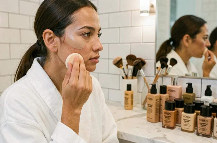
Choosing a foundation that blends seamlessly into your skin, without turning gray by the end of the day or leaving a visible line along your jaw, takes more than a quick glance at the packaging. L’Oréal Accord Parfait foundation, available in a very wide range of shades, promises just that seamless finish. The challenge is navigating shade codes, undertones, and product texture to find the closest match.
Skin undertones and Accord Parfait foundation: the factor we often overlook
Before even looking at the number on the bottle, there’s one thing to figure out: your undertone. It’s the underlying color that shows through the surface of your skin, regardless of your tan or overall complexion.
Have you ever noticed that a foundation looks yellow on a friend but natural on you, even though you’re wearing the same shade? That difference comes down to undertones. There are three main categories.
- Warm undertone (W in the Accord Parfait range): the skin has golden or peachy tones. The veins on your wrist tend to look green.
- Cool undertone (C, for “cool”): the skin has pink or bluish tones. The veins appear purple or blue.
- Neutral undertone (N): a mix of both, with no strong dominant tone. The veins look somewhere between green and blue.
The Accord Parfait range uses this coding directly in the name of each shade. A bottle marked 3.N is a neutral beige, while 5.W is a deeper golden beige. Identifying your undertone before choosing a shade number helps avoid most purchasing mistakes.
To help you decide, you can find out which shade of L’Oréal Accord Parfait foundation to choose by combining the wrist-vein test with a jawline test in natural light.
Skin-Matching technology and the current formula: what it means for everyday wear
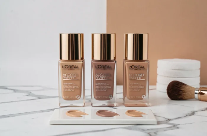
L’Oréal Paris describes the Accord Parfait formula as featuring Skin-Matching technology. The idea behind it: finely milled pigments that adapt to the complexion of each area of the face. In practice, this creates a semi-sheer finish rather than an opaque mask.
The current formula is enriched with hyaluronic acid. This hydrating ingredient helps prevent the cakey effect that some foundations can leave on dry skin after a few hours. Coverage remains natural: it softens imperfections without covering everything up, making it better suited to everyday wear than full coverage.
Skin tolerance and regulatory claims
The product information states that the formula is vegan, tested under dermatological control, and non-comedogenic. These claims appear on the packaging and product listing. They don’t guarantee that every skin type will be reaction-free, but they do indicate that the product has been evaluated on sensitive skin.
One thing to keep in mind: choosing the right shade doesn’t address skin tolerance. Anyone who reacts to fragrances or certain preservatives should check the INCI list for the specific shade they’re considering, as the formula may vary slightly from one product reference to another.
Testing the shade in real-life conditions: a practical approach
Online tools (virtual filters and quizzes on the brand’s website) can point you in the right direction. But they’re not enough to guarantee a reliable match, because screen lighting affects how colors look.
Here’s the method that works best in store or at home:
- Apply a small amount of product along your jawline, not to the back of your hand. The skin on your hand is often darker or redder than your face.
- Wait two to three minutes. The shade may oxidize slightly when it comes into contact with sebum, so the final result can look different from the initial application.
- Check the shade in natural light, near a window or outdoors. Store lighting can add a yellow or white cast that distorts the color.
- Compare two neighboring shades side by side. The right shade is the one that disappears into your skin, not the one that looks pretty on a swatch.
The shade that disappears along your jawline is the right one, even if it looks dull on the back of your hand. This simple tip helps you avoid leaving with a foundation that’s too dark or too orange.

Accord Parfait shade range: making sense of the numbering
The current range is listed as available in 48 shades, making it one of the widest selections in mass-market beauty. This broad choice is an advantage, but it can also make it harder to choose when you’re standing in front of the display.
Each shade code combines a number and a letter. The number indicates depth (from lightest to darkest), while the letter indicates undertone (N, W, or C). For example, 1.N is a very light neutral ivory, while 10.W is a deep golden brown.
Depth and undertone: two separate factors
A common mistake is to choose based on depth alone and ignore the letter. Two shades with the same depth (for example, 4.N and 4.W) can look very different on the skin. The first is neutral, while the second has golden tones. Checking the letter as well as the number is key to avoiding a foundation that “doesn’t look right” without knowing why.
The consumer self-assessments cited by the brand are based on panels (one test with 211 women in the UK and another with 291 women). The resulting satisfaction percentages reflect subjective perceptions, not an instrumental measurement of color match. That doesn’t take away from the product’s usefulness, but it’s a reminder that testing it on your own skin is still the final test.
L’Oréal Accord Parfait foundation offers plenty of options for finding your shade, as long as you treat undertone as a priority and check the result in daylight. A two-minute test along your jawline tells you more than any online quiz.